
NMDP x UC Berkeley
The National Marrow Donor Program (NMDP) is a nonprofit that connects patients with blood cancers and blood disorders to stem cell donors. Anyone aged 18 to 35 can join its registry by signing up online and sending in a cheek swab.
We worked with the NMDP to research what keeps people from joining the registry and to design solutions. I redesigned the online registration form, where many potential donors drop off, taking it from first wireframes to a high-fidelity prototype.
Research was a team effort; the form design was my own. The methods that shaped it most were a cluster map, a literature review, a heuristic evaluation and tabling on campus. We started by mapping the system. A cluster map showed that recruitment, the registry, matching and patient care all depend on one another, so a donor who drops out of the form affects everyone downstream.
The literature review showed that fear of the process stops people from joining, or from donating once they match. A heuristic evaluation found that the current form violates several of Nielsen’s usability heuristics: it leaves out key information, doesn’t say how long it takes, and doesn’t let users save their progress.
As part of our research, our class tabled with the NMDP on the UC Berkeley campus. Together we approached 571 people, but most walked past without stopping, and by the end of the day we had only 24 sign-ups. Of the 66 people I approached myself, only 2 agreed to register and be swabbed. Watching people interact with the table made it clear how ineffective this approach was: many who did start the registration form had to leave before they could finish it.
The registration form is where interest has to turn into commitment, and it was losing people there. We grouped our findings in an affinity diagram and dot voted on what mattered most. Four insights shaped the redesign:
These insights led to our core framing: how might we make it easier and more approachable to join the NMDP donor registry?
My first wireframes split registration into short steps, each starting with what that step involves. I added a reminder email so that someone who leaves partway through can pick up where they stopped instead of starting over.
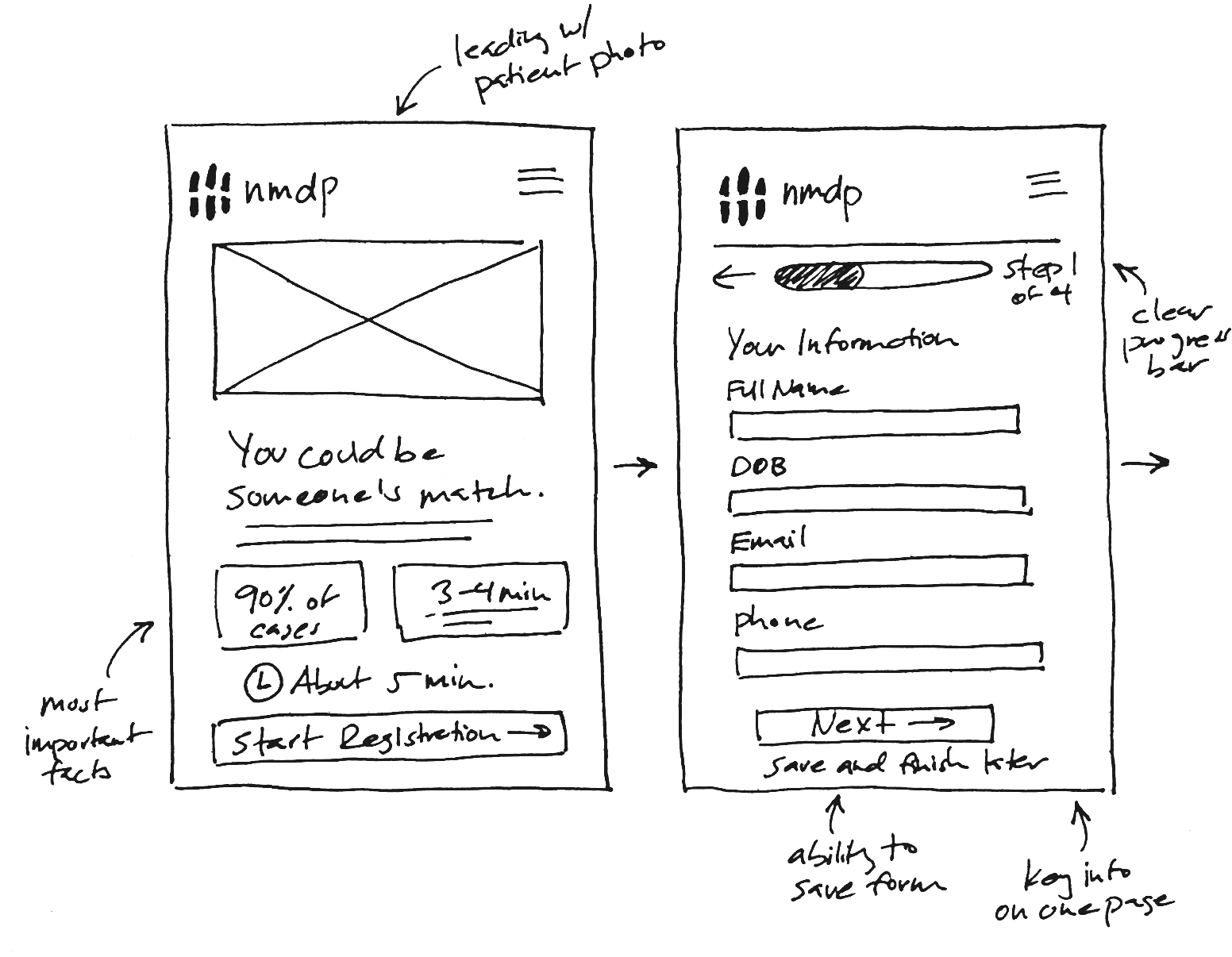
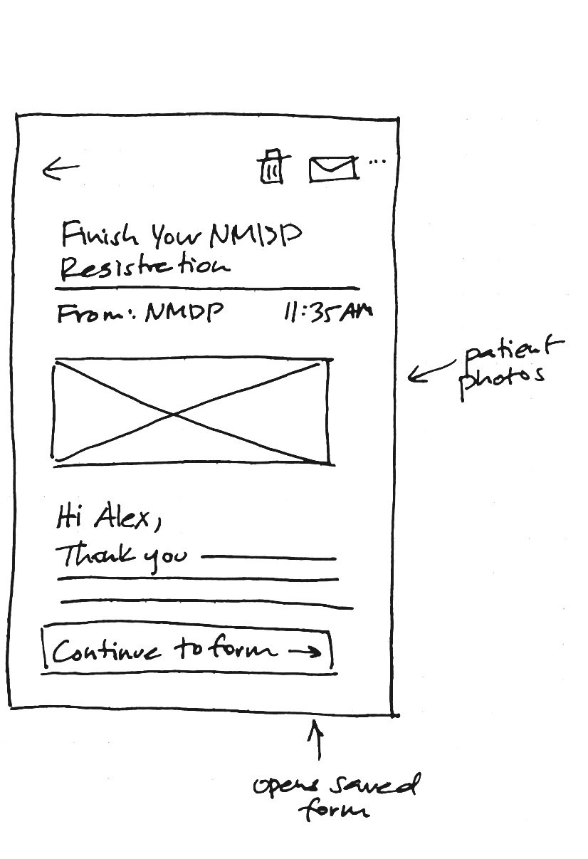
We showed our concepts, including the simplified form, to five Berkeley students in guerrilla interviews.
Everyone agreed that a simpler registration would make them more likely to sign up. Students worried about surgery, recovery and missing work or athletics, and one wouldn’t join without knowing more about the procedure. Two said anything from the NMDP needs to feel high quality, or they’d question whether it deserves their trust. After testing, I moved the key facts and a step-by-step overview of donation to the start of the form, so people learn what joining means before they’re asked for a commitment. To earn trust, I matched the NMDP’s visual identity closely.
I designed a high-fidelity prototype of the form with five key features that address the findings from our research.
The current form can’t be saved, so anyone who leaves halfway through loses their progress. At tabling, this was the main reason sign-ups were lost, so it was the first thing I designed for. Answers save automatically, a Save & exit button stays in the header at every step, and leaving sends an email with a link back.
If someone leaves before submitting, a reminder email shows exactly where they left off and takes them back to that step. The NMDP doesn’t want to spam potential donors, but our research showed that a reminder at a few points along the way would help people follow through.
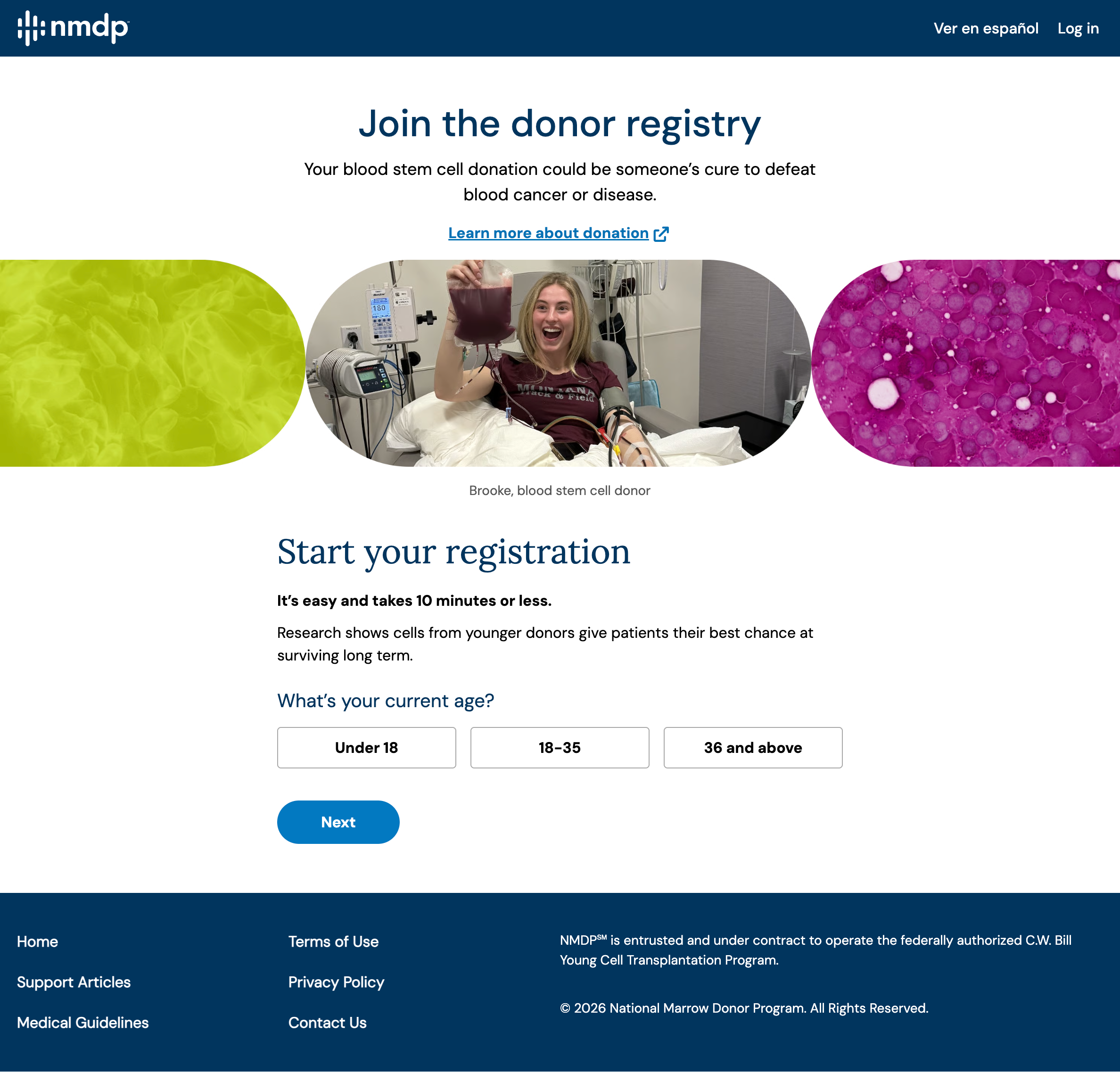
The current form only links to a separate “Learn more about donation” page, and our research showed that no one actually visited it. They needed the key facts and the exact steps of the process while they were registering, at the moment they were deciding whether to join.
The redesign opens with three key stats. Before any personal details, a six-step timeline shows the whole journey from registering to recovery, with a note that most members are never called.
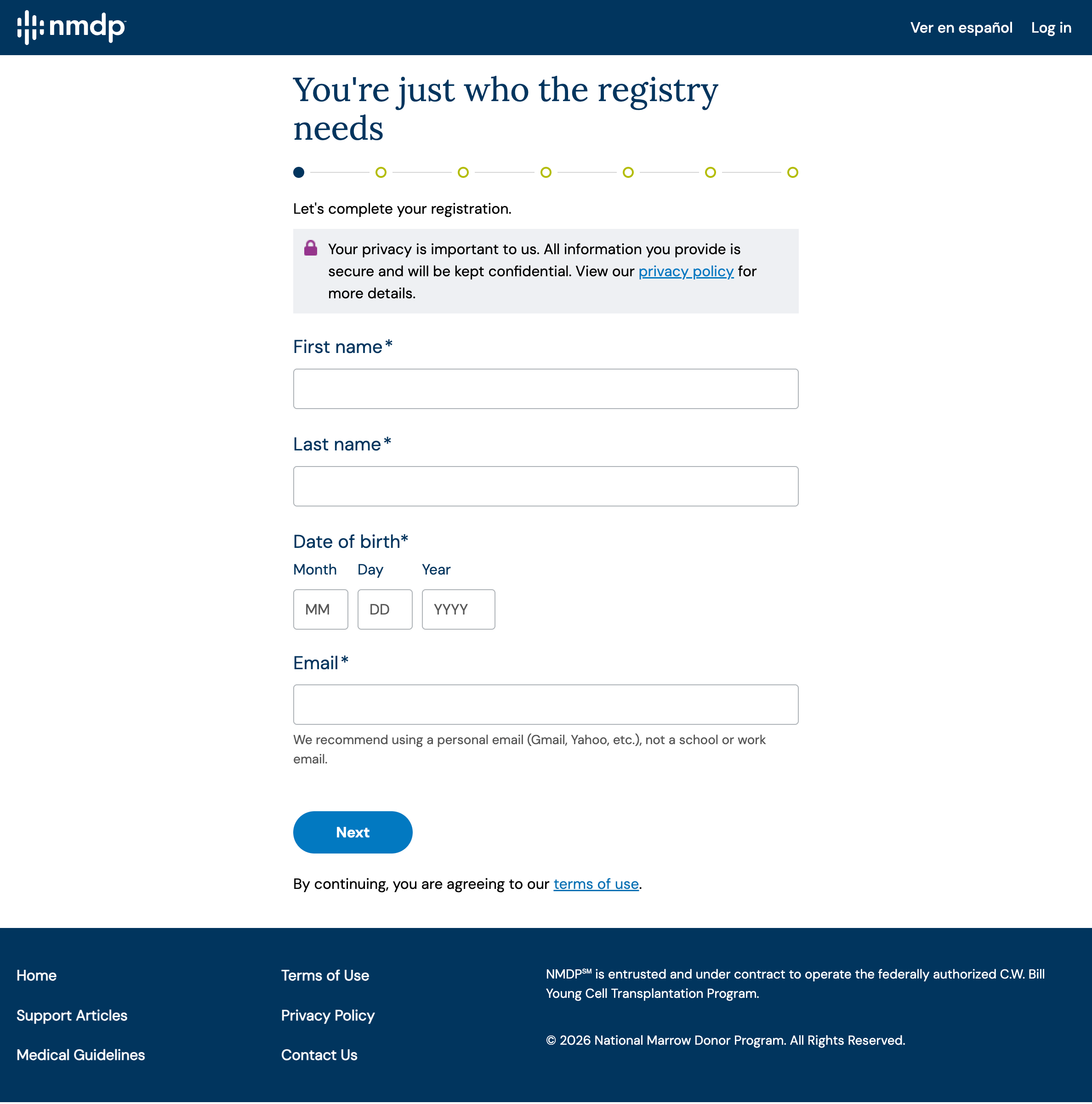
The current form is broken into seven steps, and you can’t move ahead to see what else will be asked until you’ve filled out the step you’re on. People can’t see what’s coming next or how many questions are left, which makes it hard to know how long it will take. The redesign puts everything on one long page divided into seven short sections. A navigation panel follows you down the page, showing what’s complete and how many minutes are left, and a progress bar along the top fills as you go. Any section can be reopened with one click.
Information about risks and time commitment was scattered across the site. One step now gathers it in plain language, and donors check each item to confirm they understand it.
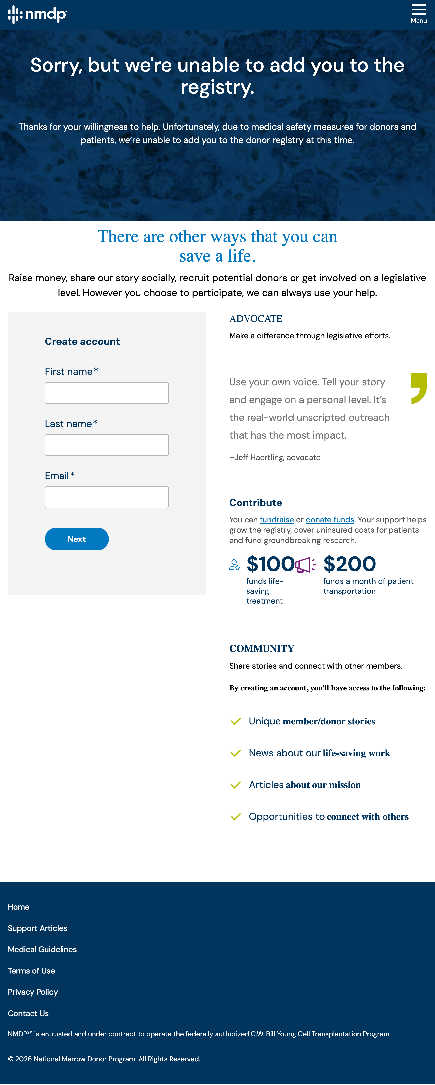
The current site redirects people who can’t donate to a thank-you page that lists other ways to help, but the options are confusing and hard to act on. The redesign tells them clearly, thanks them for wanting to help, and points them to other ways to get involved.
I presented the redesign to a guest critic, the former Head of Design at Walmart. The main takeaway was that the strength of the project lay in its restraint: every change works within the NMDP’s existing form and systems, so it could ship without a rebuild. The next step is to implement these changes and test how effective they are, comparing how many people complete registration with the redesign and with the current form.